Industry
Finance
Client
HSBC
Role
UX/UI Design
Easy Invest Landing Page
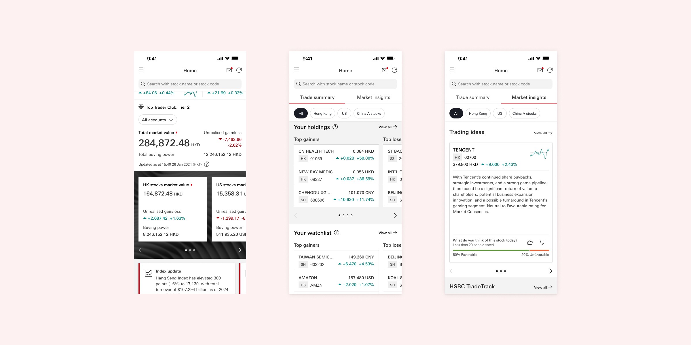
Deliver Reliable Investment Insights to Make Trading Easier
Stock investors rely on daily market updates to make trading decisions. How can we provide reliable investment insights to make trading easier? HSBC Easy Invest is an investment app in Hong Kong. The brand new landing page delivers a compact, concise and comfortable interface, offering personalized information and easy access to essential features.

Research
Inconvenient Information Navigation
User reports show that Easy Invest has two main pain points: too high commission fees and inconvenient information navigation. Thus it is our opportunity to tackle the second one. In initial stage, we conducted user focus groups to understand the gap between users' expectation and our current experience. Key pain points are as follows: - Unreasonable display sequence - Overwhelming information - Difficult to locate information Since most feedbacks are about information structure, we started our ideation from IA mapping.

Ideation
Information Architecture Redesign
We analyzed overall IA structure, conducted competitor analysis, explored multiple options and tested prototypes with some users. This exploration led us to a brand new landing page as the home bottom tab, including all feature entry points.
Ideation
Information Architecture Redesign
We analyzed overall IA structure, conducted competitor analysis, explored multiple options and tested prototypes with some users. This exploration led us to a brand new landing page as the home bottom tab, including all feature entry points.
Ideation
Information Architecture Redesign
We analyzed overall IA structure, conducted competitor analysis, explored multiple options and tested prototypes with some users. This exploration led us to a brand new landing page as the home bottom tab, including all feature entry points.

UX Design
Dynamic interaction
Here is the most exhausting and exciting part. With this idea in mind, we focused on content layouts and navigation flow of the landing page during UX iteration. Designing a clear and intuitive layout was no easy task, especially with over 10 sections to incorporate. To address this complexity, we introduced key features such as dynamic sticky headers, stock card carousels, customizable sections, and personalized content.

UX Design
Personalized Information
AI is also a good helper for this project. We introduced a new 'AI Story Card' feature to generate personalized stock insights based on user data and market updates. We collaborated with product, data and UX writing team to design from contents to components. The UX design proved to be a substantial undertaking. In total we delivered around 20 sub journeys, including all new sections and entry-point flows. This process also provided an opportunity to revisit and refine existing user journeys, further improving the overall user experience.

UI Design
How to build consistent & localized UI?
Delivering a clear and intuitive UI for information-heavy pages is always crucial. In this project, we encountered a unique challenge balancing the HSBC global design system with the practical needs of our target users. We usually use HSBC global design system for each journey, but designing for the HK investment service revealed differences between Asian and Western user preferences. Asian users like more condensed layouts and smaller fonts, which created a gap between the design system’s standards and local user expectations.

UI Design
How to build consistent & localized UI?
To bridge this gap, we implemented two key solutions: - Introduce new stock card components to design system for local needs. - Collaborate closely with the global design team to ensure UI alignment. We held regular meetings with the global design system team to balance between global design system and local user experience. This project became a valuable exercise in applying a global design system to real-world scenarios.

Conclusion
Keep calm and make a trade-off
We conducted nine in-person interviews with HK users to validate our final prototype. Most users appreciate the new landing page, particularly its improved information architecture and customization features. However, some details required further refinement, such as the clutter of information, credibility concerns on AI content, and visual hierarchy. Improving digital financial services is never an overnight process. In this project, we struggled with complex information design, back and forth cross-team collaboration, and strict regulations for both content and design. Yet it is also a valuable learning experience for me, to understand further on financial service, information architecture and design trade-off.